
After spending time understanding how everything fits together, I started working on the first dial.
On screen, it looked right.
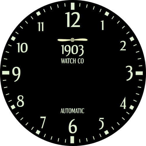
Balanced. Detailed. Interesting.
It had everything I thought a watch should have.
First Attempt
But the more I looked at it, the more it didn’t make sense.
Balanced. Detailed. Interesting.
It had everything I thought a watch should have.Too much happening. Too many elements competing for attention.
At a glance, it felt crowded.
It took effort to read.
That was the problem.
A watch shouldn’t require effort.
So I started removing things.
Then removed more.
What was left felt simpler. Less impressive at first—but clearer.
And clarity matters more.
That was the first real adjustment:
Not designing for how it looks.
Designing for how it works.