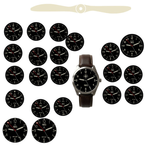
There's a graveyard of good ideas behind this watch. Elements that made sense on their own, looked considered in isolation, and solved a real problem — right up until they met everything else.
Extra text. Additional markers. Layout variations. Each one added something to the dial — and quietly took something else away. A little clarity here. A bit of balance there. Nothing dramatic enough to reject outright, but enough to make the whole feel slightly less than it should.
The hardest things to cut aren't the bad ideas. They're the ones that almost work — the ones that are good enough to argue for, but not good enough to keep.
Removing them wasn't a judgement on the ideas themselves. It was a judgement on fit. Something can be well-considered and still wrong for this — and learning to make that distinction cleanly took longer than expected.
The rule that emerged was simple: if it doesn't improve the whole, it doesn't stay. Not "is this good?" but "does this make everything around it better?"
That shift — from evaluating parts to evaluating the whole — changed what the editing process felt like. Less like losing things. More like the design finding its own edges.