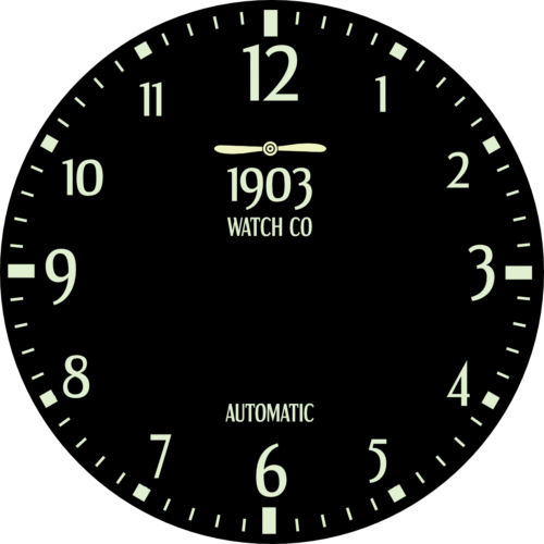
On screen, it looked like a watch should look. Balanced. Considered. Every element placed with intention. I looked at it for a while, feeling like something was finished.
Then I strapped on a printed test piece and glanced at my wrist.
It took a moment to read. Not long — a second, maybe less. But a second is too long. That hesitation was the whole problem, right there on my wrist.
A watch that requires effort has already failed. You shouldn't have to look at a tool to use it — you should just know.
So I started removing things. Space here. Logo there. Each cut felt like a small loss — detail I'd spent time on, gone. But every time something came off, the dial breathed a little easier.
What was left looked less impressive on a screen. Less interesting to zoom into and study. But at a glance — the only glance that counts — it was immediate. Clear. Certain.
That was the first real shift in how I thought about design: not what looks right, but what works right. The two are related — but they're not the same thing.
Every decision after that started from function and worked backwards. Clarity first. Everything else earns its place.