After the watch, the website felt like it should be the straightforward part. Pick a theme. Arrange the content. Done.
It wasn't. Themes that looked clean in previews felt cluttered with real content inside them. Layouts that seemed right for an hour revealed something slightly off by the next morning — a spacing issue, a hierarchy problem, a tone that didn't match what the watch was trying to say. Small things. But small things compound.
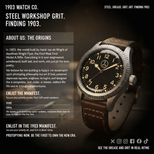
There's a difference between looking right and feeling right. One is immediate. The other only reveals itself over time — and it's the one that matters.
So the process looked familiar. Reset. Remove. Reconsider. Less structure, not more. Fewer decisions competing for attention on the same page. Typography that gets out of the way. Spacing that lets things breathe.
At some point it stopped being a design problem and became a clarity problem — the same shift that happened with the dial, just playing out across a different canvas.
Clear. Quiet. Nothing extra. The principles didn't change — they just needed applying somewhere new. Which, in hindsight, was the whole point of having them.