
Not everything made it through.
They weren’t wrong. They just weren’t right enough.
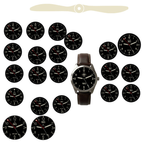
Some ideas looked good on their own.
Some even worked in isolation.
But when placed in the full design, they didn’t hold up.
Extra text. Additional markers. Variations in layout.
Each one added something—but also took something away.
Clarity. Balance. Focus.
They weren’t wrong.
They just weren’t right enough.
So they were removed.
Not because they didn’t work—
but because something simpler worked better.
That became part of the process:
If it doesn’t improve the whole, it doesn’t stay.